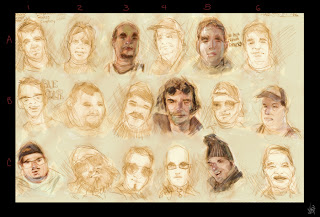


These newest pieces I did are early character design studies for one of my senior thesis pitches. These thesis' are 1 to 2 minute computer animated shorts that are worked on all of next year. I REALLY need your guys' help and opinion. Just based on appeal alone which of the heads are you finding the most succesful (colored or not)?? I labeled them to help ... After I select my better ones I will do variations in hair stlye and the placement of the facial features, then body, clothes, etc, etc. I hope to post the progressions and gain some valuable feedback from you guys. I'm excited to see your responses! Take care! Oh, and by the way I haven't locked down if the character will be male or female yet so at this point I'm open to either.

2 comments:
I Think your first page up there has got some of the best diversity. I would suggest pushing the shape of the face to an almost unnatural lengths to get more variation. It may mean distorting the features past the level of realism you want but then you could pull back to the appropriate spot. Out of the hundred some faces you have up here my favorites are
(a4,b5,c1,c2,d2 the chin is what grabbed ne, f4 teeth caught my eye, g4)
I see a lot of personality in these specifically. The way you are painting these has a lot of style too, so you can bolden whichever design you choose with some rocking PS credentials. keep crankin man!
-Tamte
I don't see where they are numbered. What am I missing? But I enjoy the last guy in the second row of the mens sheet and also the second guy on the same row. I like the first girl in the second row on the first women's sheet and the fourth Indian woman in the first row on the last sheet. These faces seem to stand out because they are believable and come with a preconcieved personality. Some of the other faces I have more or less seen before. Also for the most part they all look pretty young (only a few exceptions) have you considered older characters?
Post a Comment