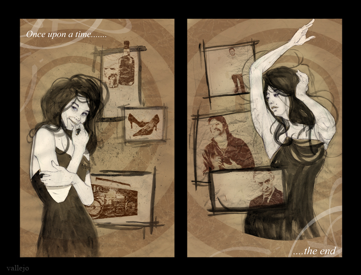
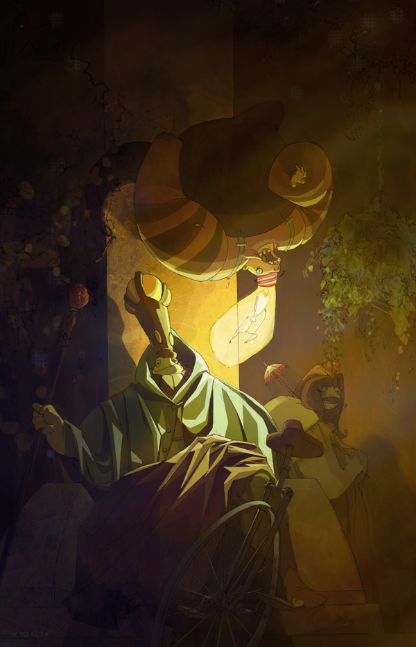
A group of Illustrators are putting together a collection of 2 page comics so I though I'd put something together for this great idea. This is the result. If anything, I confirmed that I need some graphic design classes..
Like the title says: a shawty with a boomstick. Actually I have to decide which version to use for the ol' portfolio. What do you guys think: the one with glow (lighter) or the one without? Also looking to do more environments, probably the most neglected aspect of my art now. Enjoy.
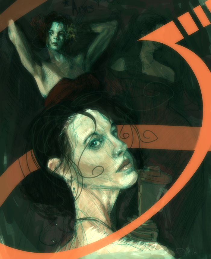
Got distracted from animating after I found the figure reference site http://lockstock.deviantart.com/gallery/ . It has awesome costumed female models along with a lot of classy nudes. Anyways I just sketched freely, experimenting, and tried to challenge myself to make the composition work in Photoshop. I brought it into Shake "post" and added some custom glow. Next, I have a old photograph book that I often draw from so I again sketched out an image in my sketchbook and photoshoped it up. Enjoy ladies and gentleman.
Real excited! I finally took the leap and made the leap into an official CGsociety memeber. This mean that I have my own portfolio page at CGsociety and they can host my pictures and my demo reel (when it's finished). It should be a great tool for employer's also.
To get into my head a little when I make a piece I put together this time lapse of my latest piece. Personally when other artists post things like this I learn tremendous amounts so hopefully somewhat can benefit. Enjoy!
Probably my most complicated image I've worked on. The lighting was tricky and I think that the highlights look pleasing but I'm not sure they accurate reflect the form. Also, about two weeks ago I was sure that I was going to use these characters for my thesis, but I've decided against it. It's too big of an idea. Thanks to Adam Hughes for inspiration in my coloring http://www.justsayah.com/.
...included my reference for lighting hahaha....thanks Javi and Elisa
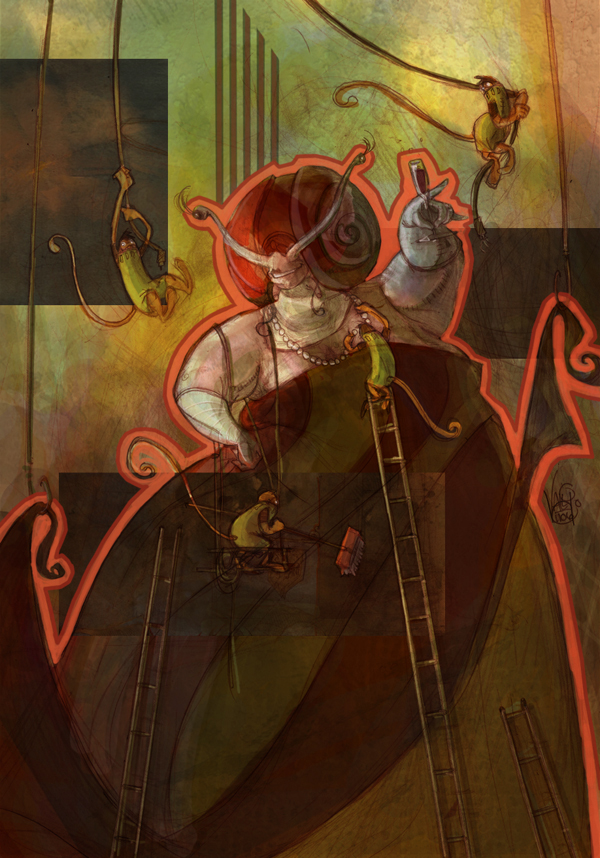
Began this as a character design project but turned into more of an Illustration/design project because I ran out of time for detailed rendering. I am starting to realize the importance of texture in digital painting, it helps soooooo much..Enjoy.
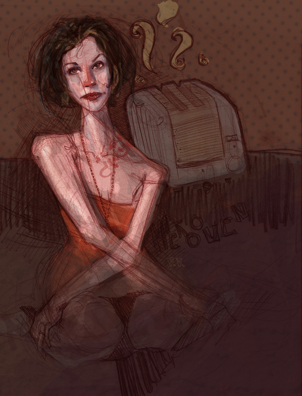
pencil sketch imported into photoshop..just goofing around. Check out Joao Paulo Alvares http://souvlaki.jp-ar.org/ and the mighty James Jean (fan site) http://www.jjeanius.net/ . These sites make up 90% of my reference and inspiration lately.
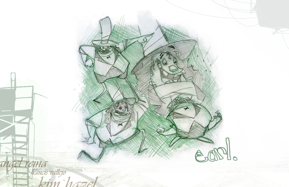
Now we know Earl can move out of his turn-around pose haha. David Feiss (of Ren and Stimpy, Cow and Chicken) is the king of facial expressions and influenced this guy a lot.