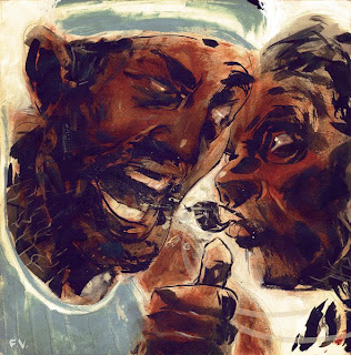

Hey folks! Here are some recent illos. Ink and gouache with halftone applied slightly to the grey one and a little more digital alteration to the darker one. I did two versions as an experiment. Had to do these quick. I was asked to illustrate a conversation.... Crits?...It's been a long night, not sure how I feel about these.
take care,
-francis

11 comments:
Really like the top pic! EMV
I think the bottom works better in terms of contrast and caricature, the top one seems like its missing something - maybe its too clean. But the top also has some caricature that isn't workin - I think it might mainly be in the left guys mouth area. But I love the bottom one, great contrast and the brushes make the conversation a bit more chaotic which I think is what youre goin for right?
LOVE THE LAST ONE.
I really like the darker one, cause its strenght and more interesting tecnique. It has a lot of life more than the other
The bottom was my favorite piece out of all the ones done for this assignment - That's the level of freshness and energy I always aspire to, and find myself really responding to way more than tight, "finished" color work these days. Great job, man.
I was curious as to where you were going to take this one, and as always I'm very impressed with what you did with it! I'll have to agree with Kyler on favoring the second one since it's not so rendered, it makes it the best of the two. Can't wait to see what you do for these next assignments! Keep up the good work.
AWESOME!
cool stuff francis! i like the bottom one better, its got grit and sweat.
Of the two I think the top is a stronger illustration for print. It's a clear read and that's what matters. The second I love for the technique and design. The bottom is a little too messy to really sell what's going on and I think you fell in love with the fun of it. They both have great personality and I think they're worth keeping for the portfolio. Thanks for sharing with us Francis.
these are awesome! love the top
tyhe bottom one is very powerful compared to the grey one. im a sucker for traditional media anyway. thanks for the comment.
I've been designing and animating at some great studios on some wicked projects. and some steady freelancing. Ill keep u posted via blog when evrythings a go.
once againg great stuff .
I have to say that bottom version works the best. However, I must say that you should polish the readability of the whistle a bit more. Other than that, I'd say the bottom is far ore successful.
-Hen
Post a Comment